A new partnership has been formed between “Pencil designs” (which is a leading Egyptian agency in brand identity design) and “standard industrials” (which is a company that owns the “Nova” brand) to do the rebranding of their long-standing electric home appliances brand “Nova”.
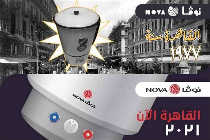
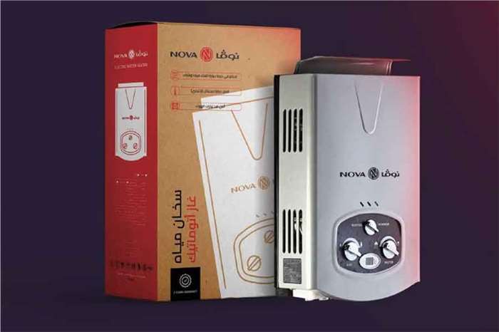
“Nova” is one of the first brands that manufactured washing machines in Egypt. They have been present in the market since 1977, making them pioneers in the field of electrical home appliances. The idea of rebranding was based on the fact that “Nova” wanted to present a new and refreshed outlook on the brand rather than the outdated designs of the past. This rebranding is supposed to set “Nova” apart and make it stand out among its competitors.
Was the rebranding necessary?
According to Mr. Moneer Kilany CEO at “Pencil Designs” the re-branding and re-launching of "Nova" were planned very carefully to make sure that the history of the brand and its personality were all present while coming up with a new brand identity. The amount of research and studying that was done to understand everything about the brand would guarantee a strong positioning in the market.
Mr. Moneer Kilany also mentioned that while they were building the new brand identity they tried to focus on futuristic visions of marketing and business, but not forget the heritage and history of the brand. Since the old brand identity did not reflect the technological advancement and was less innovative a change was required to take place.
How was the rebranding done?
The decision to go for a complete rebrand did not come easily to either Pencil designs” or “standard industrials”. “Nova” was a brand that has existed for decades in the Egyptian market and has been advertised in a certain way for years, reintroducing the brand in a new light could potentially cause harm and not benefit it but with extensive research, a complete rebranding with a new identity was found to be a perfect idea.
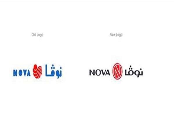
The rebranding included a change of the logo where the new logo included the iconic red color with a smart representation of the alphabets that make up the word Nova. The N id inside the O and is highlighted by the V and A. since the end of 2021 the new logo has been used on all products and digital platforms as well for a successful introduction.

Leave a Comment