Rabsha film - Branding

About Project
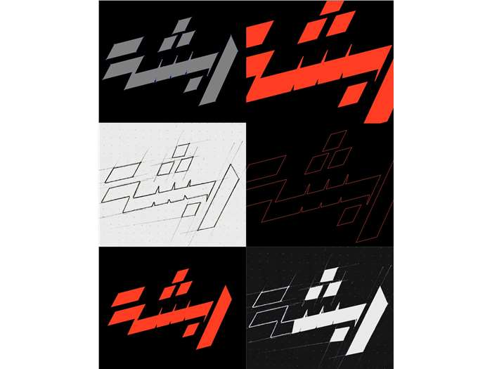
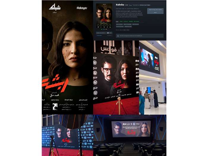
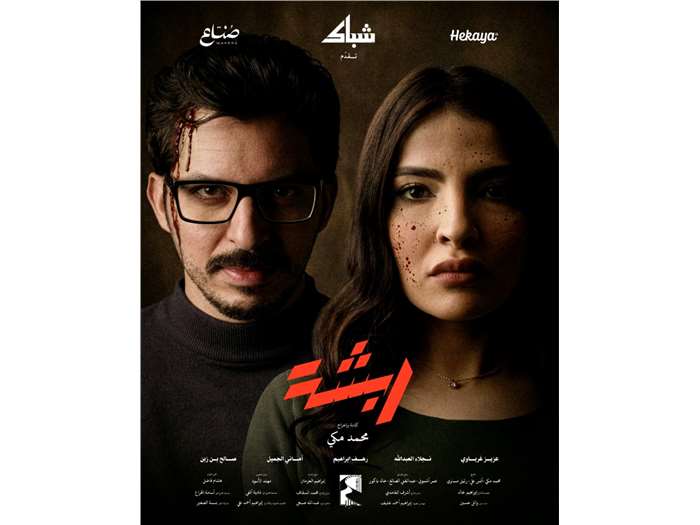
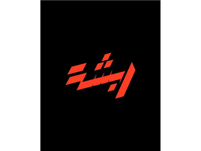
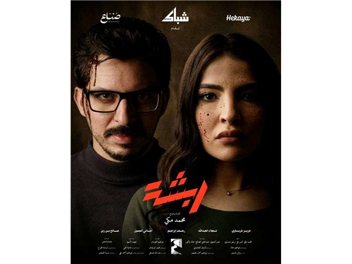
The Objective To develop a high-tension visual identity for the Saudi film Rabsha. The goal was to bridge the gap between crime and comedy by creating a "disruptive" brand language that mirrors a narrative where nothing is as it seems. The Strategy Visual System: A bold, aggressive red palette was chosen to symbolize danger and violence, repurposed to reflect the "Rabsha" (chaos) and instability defining the characters' relationships. Typography: The logo utilizes sharp angles and irregular, fragmented letterforms. This "incomplete" look creates a sense of mystery and motion, suggesting a story that is still being pieced together. Poster Art Direction: We utilized rigid symmetry in character close-ups to build psychological tension. This stillness is intentionally disrupted by subtle, "non-traditional" blood splatters that act as a touch of dark satire. Cinematic Atmosphere: Warm, deep lighting was integrated to provide dramatic depth, signaling that every character carries a hidden secret. The Deliverables Bilingual Logo (Ar/En): A cohesive primary mark designed for both Arabic and English markets. Visual Identity: A complete system including color theory, deconstructed patterns, and typographic rules. Theatrical Posters: The main official movie poster plus a series of individual character posters. Brand Guidelines: A comprehensive brand book ensuring the film’s unpredictable tone remains consistent across all platforms.
Gallery